 Sorry for the delay in uploading Week 3 of the MyPhotoSchool Adobe Lightroom Course, we have been very busy photographing newborn babies and weddings this past few weeks, but I have finally had a chance to write up week 3 for you all so here it is. You can check out Week 1 and Week 2 of the course too.
Assignment 3 delves deeper into real editing, and this time I chose the following tasks to complete.
- Better black and whites.
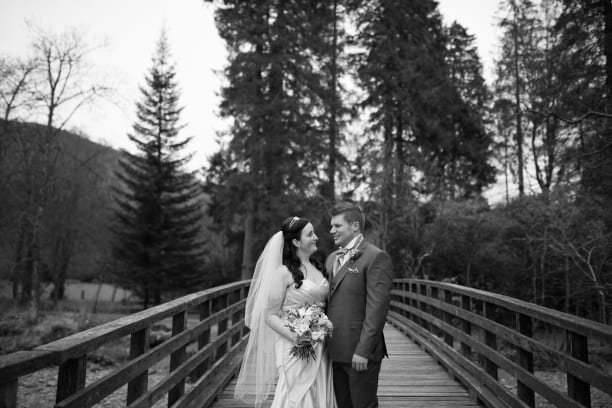
 Black and white images are stunning, they tell a story that some colour images fall short with. Conversion to black and white can be easy, but doing so correctly isn’t. Skin tones can look too dark, the landscape can look odd and this is where using the colour sliders comes in handy. My couples skin tones were too dark ,and as most skin contains a lot of orange, a quick lift of the orange channel brightens their faces, without making them look like ghosts.
2. Split toning.
 Not so much of a correction used during editing, but can be used to add a creative effect to an image, be it a subtle colour tone in the highlights or shadows or a very obvious tint. I must admit im not a fan of split toning at all, it has no place in my workflow but for the purpose of the exercise I’ve demonstrated very simply how it can be applied to image highlights.
3. Lens correction.
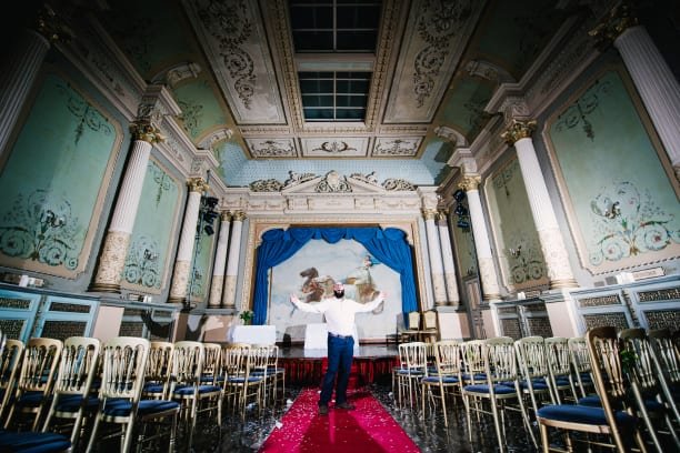
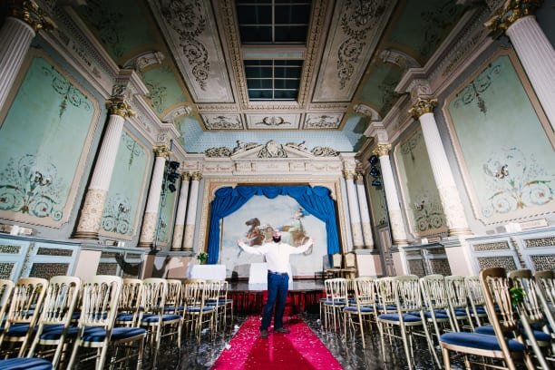
 Shooting with a wide angle lens such as the 16-35mm one I’ve used for the above image can produce a lot of image distortion with curved lines where there shouldn’t be, and darkened corners. Its just down to the science behind the lens, and different lenses of the same mm can vary. Following the instructions in the video, you can easily correct the image using light rooms tools which are custom made for each lens for various manufacturers. Nice and easy.


Have to agree with you re how stunning black and white pictures can look. They somehow put the subject at the center of the pic, so all the other stuff fades into the background. Love the puppy, great blog and thanks for sharing.