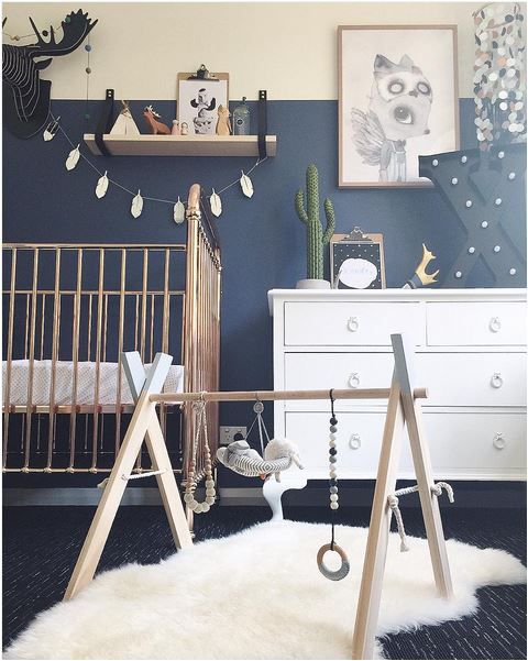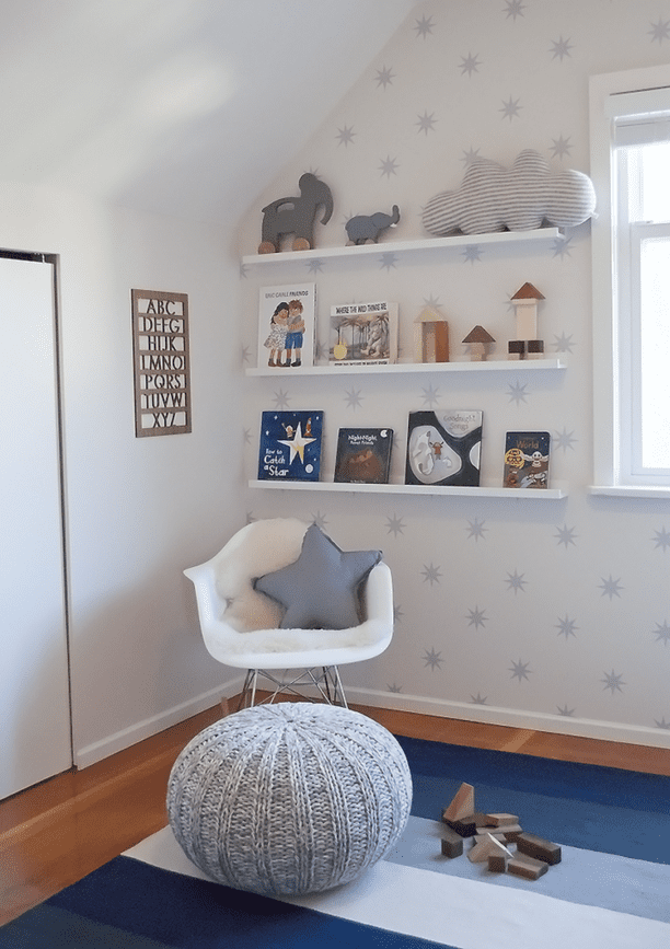
Even before we knew if we were having a girl or a boy I had started planning the perfect nursery in my head – bold monochrome with hints of gold for a girl or navy blue and grey with a star motif for a boy. When we found out bean was a little boy that meant I could start properly planning his nursery and I knew I wanted to stick with my original plan and luckily Jon agreed. We aren’t baby blue type of people and I knew we wouldn’t want anything too childish, I would rather a room that he could grow with and one that would last him till he was older, plus of course it would have to be stylish and work with our general home decor too.
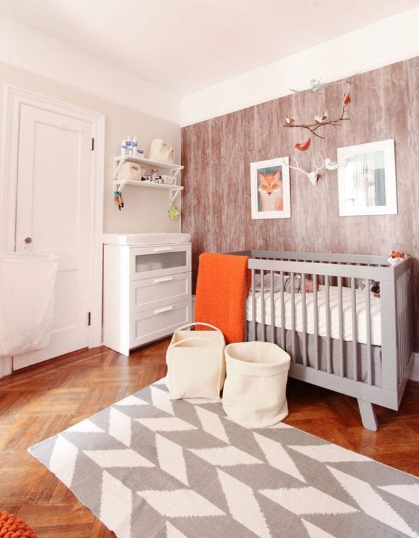
Once we started properly working on his room I was a little worried it was going to look a little too dark with the deep navy blue wall (just 1) and all the grey accents so I decided we needed to add just a little pop of a brighter colour to lift the room and make it a bit more fun. I turned to Pinterest for some inspiration and the big thing I loved was bright orange paired with navy blue and I already happen to adore fox motifs so we had a plan! I literally love nothing more than planning home decor and searching out the perfect items to compliment the look and feel of the room, plus it has really helped keep me occupied during the last few months of waiting!
Weirdly we saw the perfect navy blue colour at a clients home when we were photographing their newborn, it was on one wall in their living room and I loved it so much the Dad went to find the pot for me so I could know the exact shade! (It was this one from B&Q if your interested before our officially nursery reveal post.)
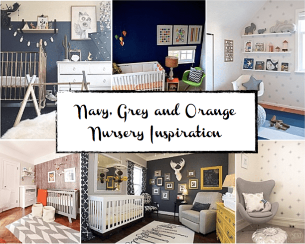
So here are a few of my favourite navy, grey and orange nursery inspiration / kids room pins which have helped inspire beans room.

The Mumma Vault 
Apartment Therapy

Mini Style
Har.com  Project Nursery

What theme/idea/colour scheme did you chose for your newborns nursery? Are you a fan of traditional baby blue and baby pink, did you go cream and natural or chose to go with something a little more bold!
